
Zabarjad Al Sharq: A Real Estate Identity Shaped by Gypsum Carvings
Project Overview
Client: Zabarjad Al Sharq Real Estate Establishment
Sector: Real Estate
Services: Visual Identity, Brand Guidelines, Applications
Year: 2026
Studio: Aurisy Studio
The Challenge
Real estate brands in the region often look alike: skylines, keys, rooftops, and generic blue or gold palettes. Zabarjad Al Sharq Real Estate Establishment wanted something different. They needed an identity that felt premium without being loud, rooted in local culture without feeling old-fashioned, and flexible enough to work across signage, print, and digital platforms.
Our goal was to build a brand that communicates trust and lasting value, the two things people look for when making one of the biggest decisions of their lives: buying or investing in property.
The Story Behind the Name
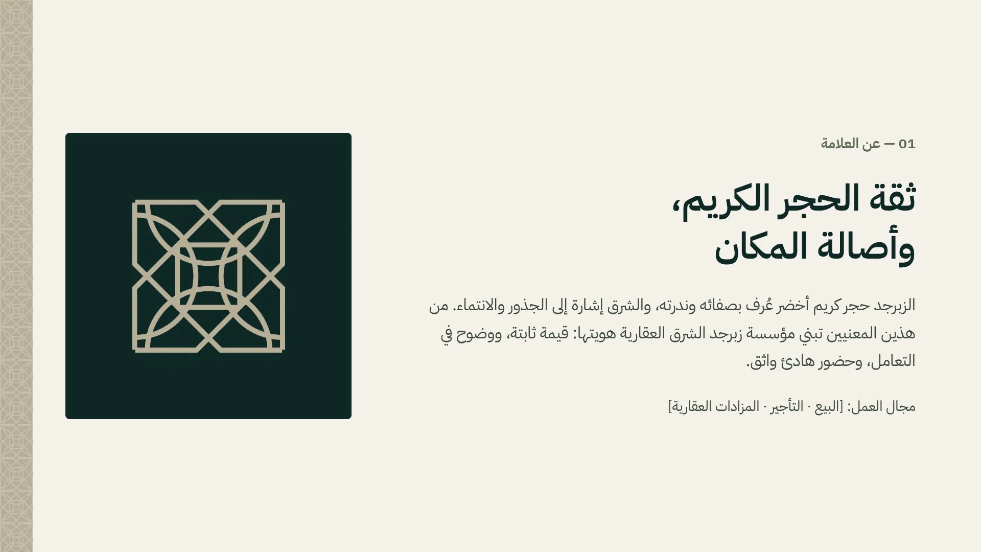
Every strong identity starts with meaning. The name “Zabarjad Al Sharq” holds two powerful ideas. Zabarjad, or peridot, is a rare green gemstone known for its clarity and natural beauty. Al Sharq, “the East”, speaks of roots, belonging, and the Eastern Province itself.
We saw an opportunity to connect these two ideas through a third element: the gypsum-carved houses of the region. These traditional homes, with their intricate geometric screens and carved plaster walls, represent craftsmanship, heritage, and a deep sense of home. Bringing them into the identity allowed the brand to speak about property in a way that feels personal and local.
The Logo Concept
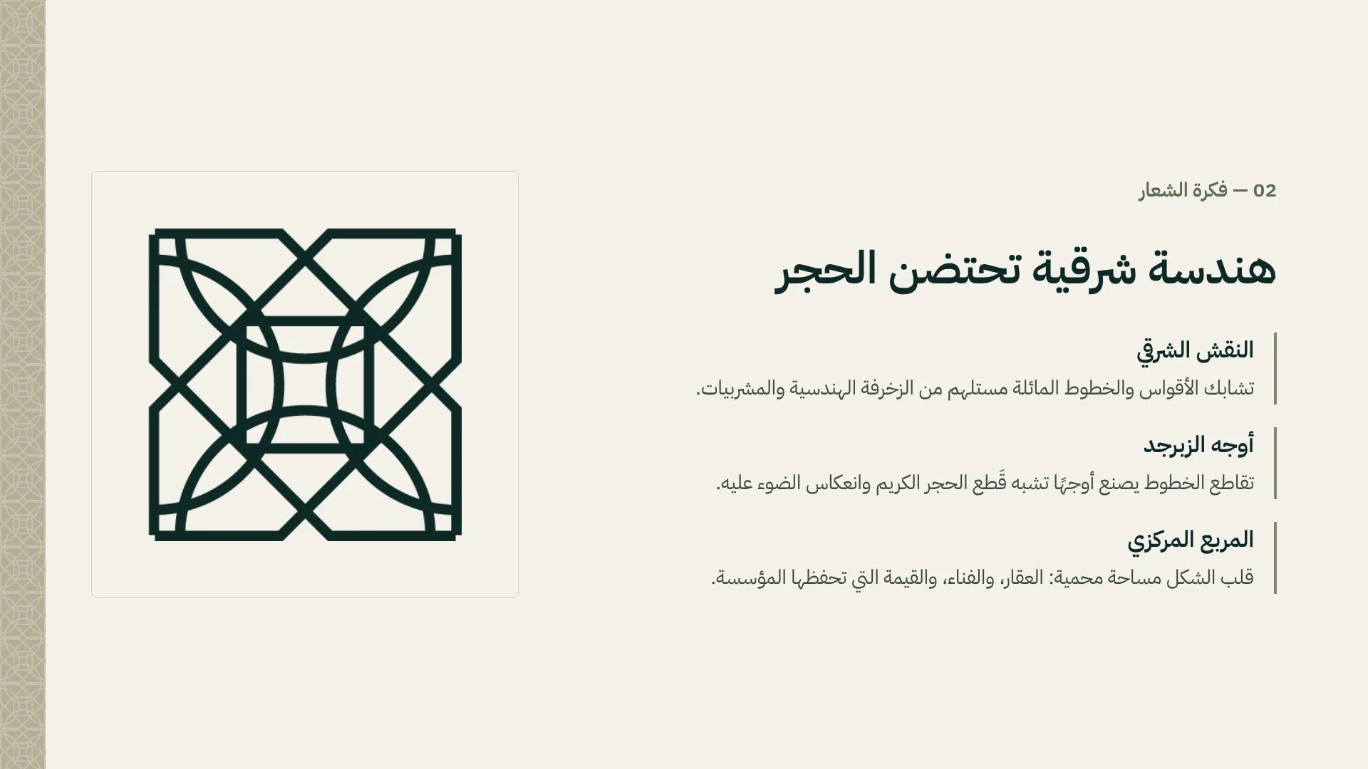
The icon is built from interlacing arcs and diagonal lines, inspired by the geometric patterns carved into gypsum and the wooden mashrabiya screens of traditional architecture. Where the lines intersect, they create facets that echo the cuts of a precious stone, catching light from every angle.
At the center of the mark sits a protected square. It represents the property itself, the inner courtyard found in traditional homes, and the value that the establishment safeguards for its clients. The result is a symbol that feels both timeless and modern, simple enough to recognize instantly, yet rich enough to tell a story.
A Flexible Logo System
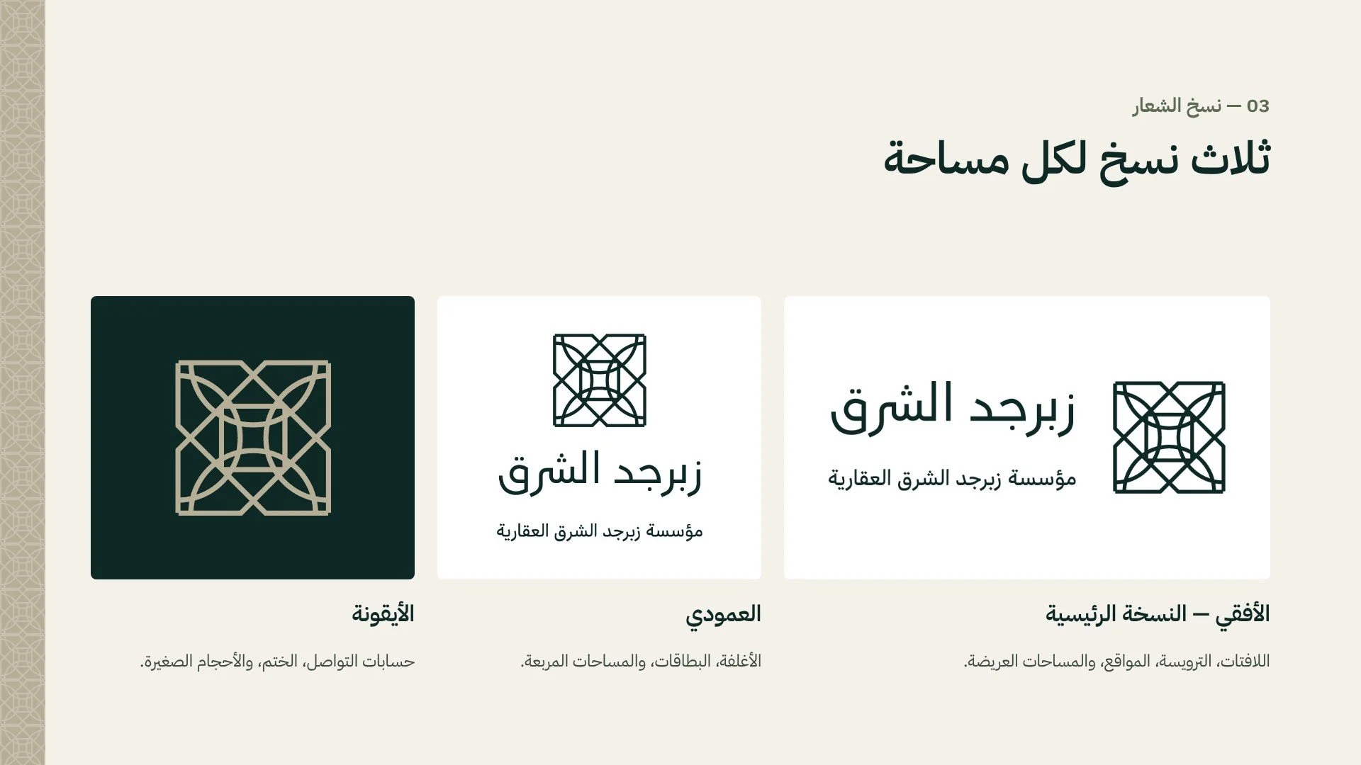
A real estate brand appears everywhere, from large building facades to small social media avatars. To support this, we designed three versions of the logo:
Horizontal: the primary version for signage, letterheads, websites, and wide formats.
Vertical: for covers, business cards, and square layouts.
Icon: for social media profiles, stamps, and small applications.
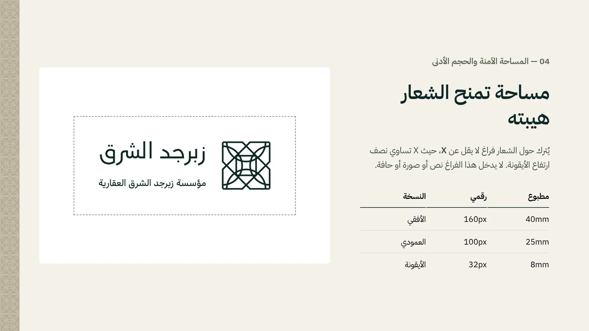
To protect the logo’s presence, we defined clear space rules and minimum sizes for both digital and print use, so it always appears confident and uncluttered.
Color Palette
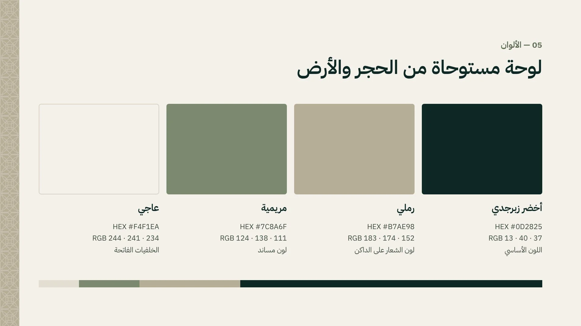
The palette is drawn from stone and earth. Deep Zabarjad Green is the primary color, a rich, grounded tone that reflects stability and value. It is paired with Warm Sand, inspired by the natural tones of plaster and limestone, along with Sage and Ivory as supporting colors.
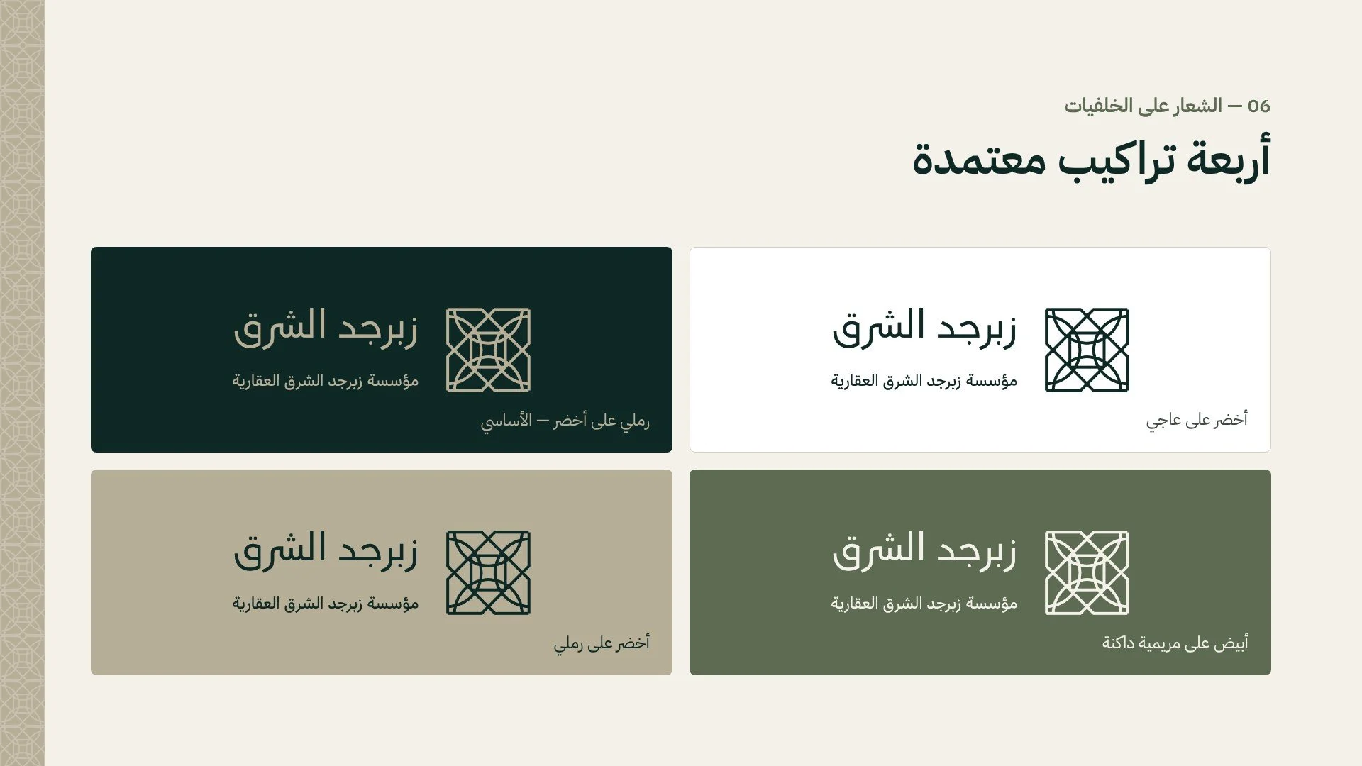
We also defined four approved color combinations for the logo, ensuring it always has enough contrast and stays consistent across every background.
Typography
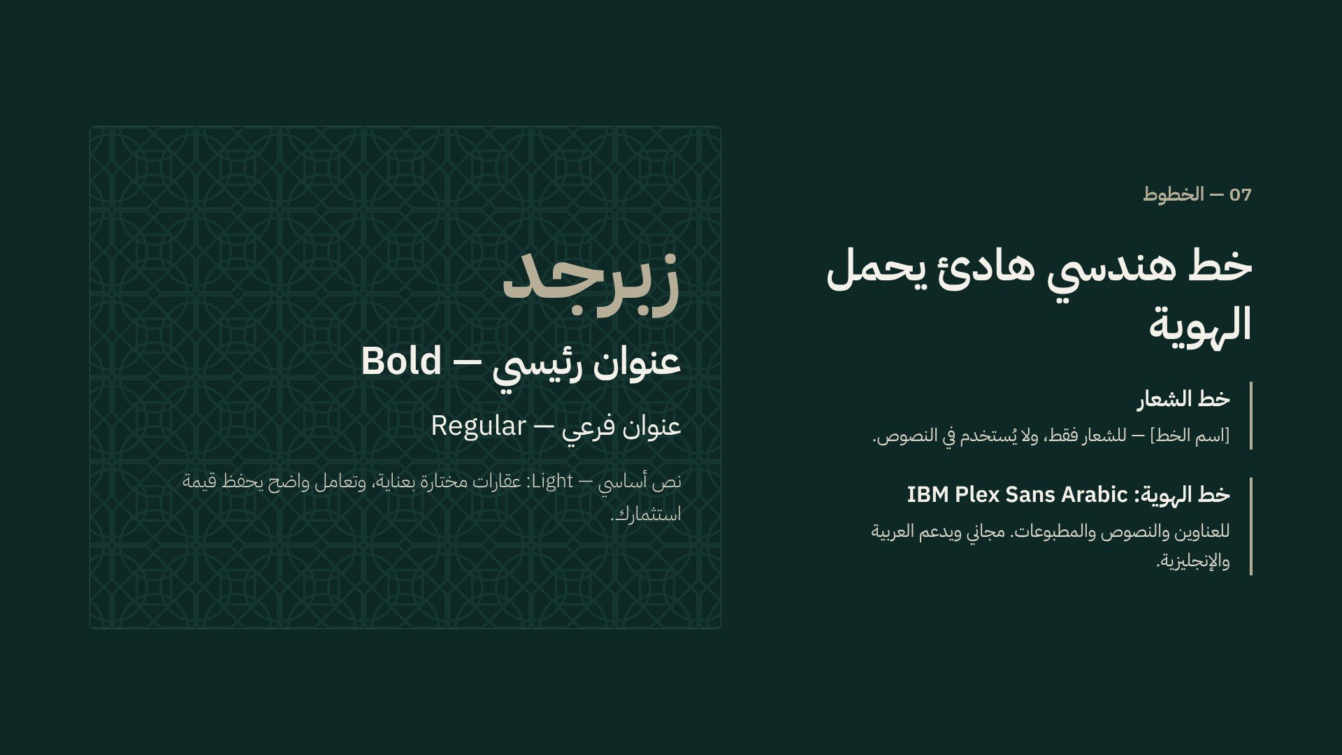
IBM Plex Sans Arabic was chosen as the brand’s supporting typeface. Its clean, geometric forms complement the logo’s structure while staying highly readable in both Arabic and English, making it ideal for property listings, documents, and digital content.
Patterns and the Decorative Band
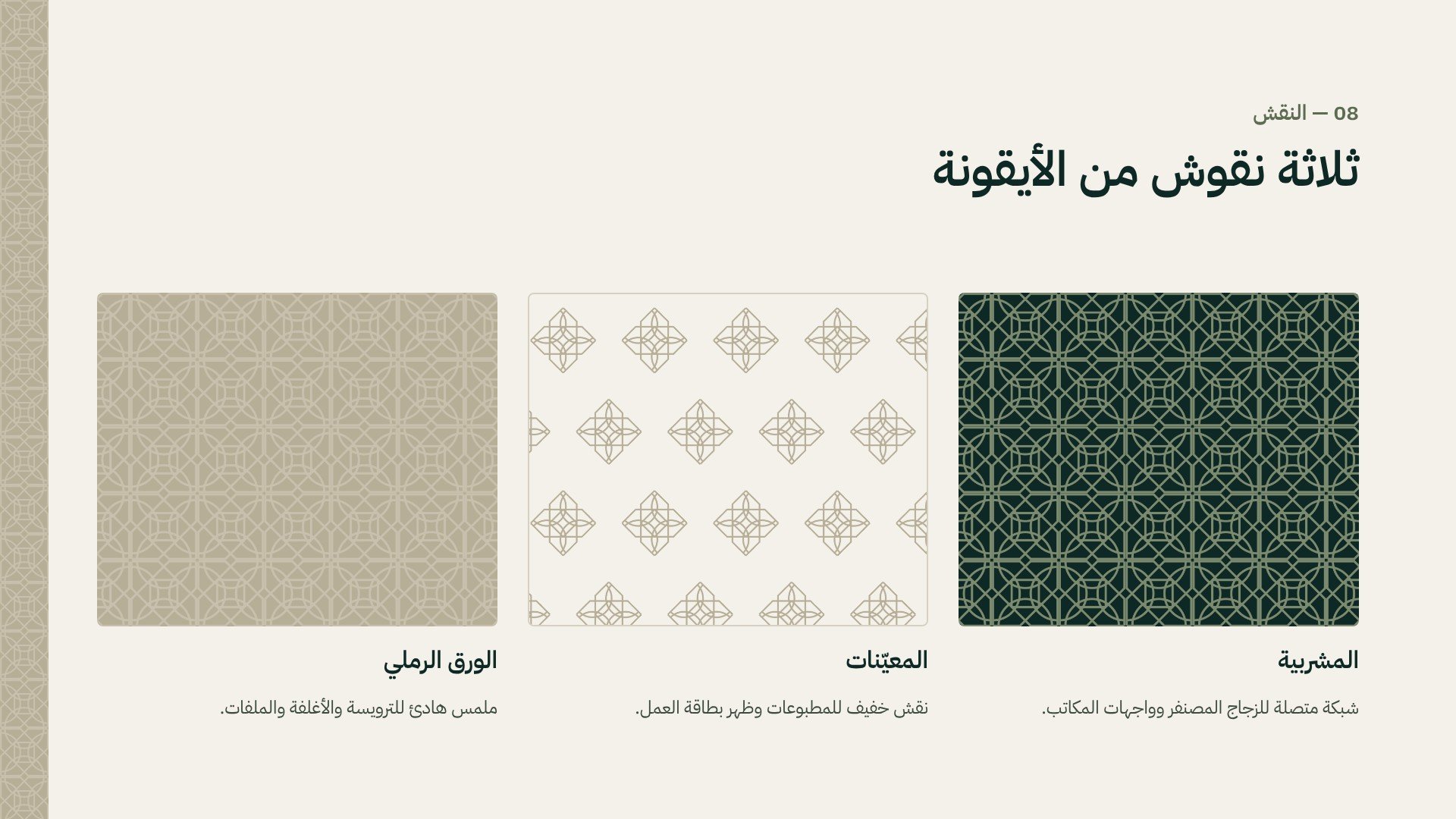
To give the brand a richer visual language, we turned the icon into three patterns:
Mashrabiya: a connected lattice for frosted glass, office walls, and large surfaces.
Diamonds: a light, airy pattern for print and the backs of business cards.
Sand Paper: a subtle tonal texture for letterheads, covers, and folders.
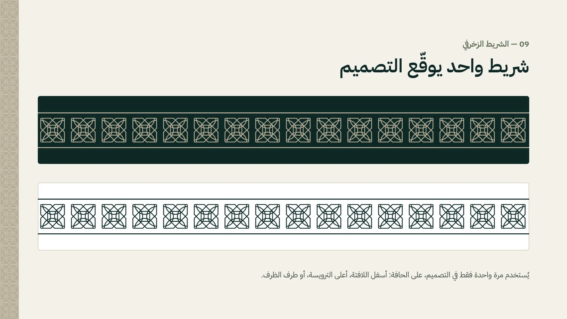
We also created a single decorative band that works like a signature. It appears once per design, along the edge of a sign, letterhead, or envelope, adding a refined finishing touch without overwhelming the layout.
Brand Rules
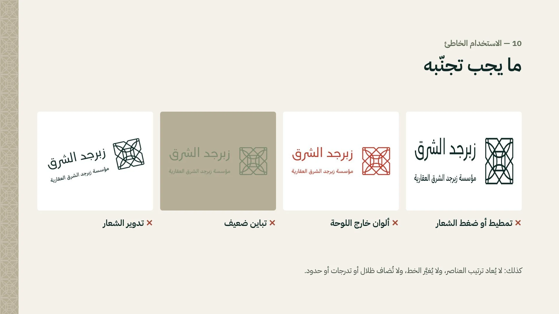
A strong identity needs clear boundaries. The guidelines include common misuses to avoid, such as stretching the logo, changing its colors, rotating it, or placing it on low-contrast backgrounds, so the brand stays consistent no matter who applies it.
The Identity in Real Life
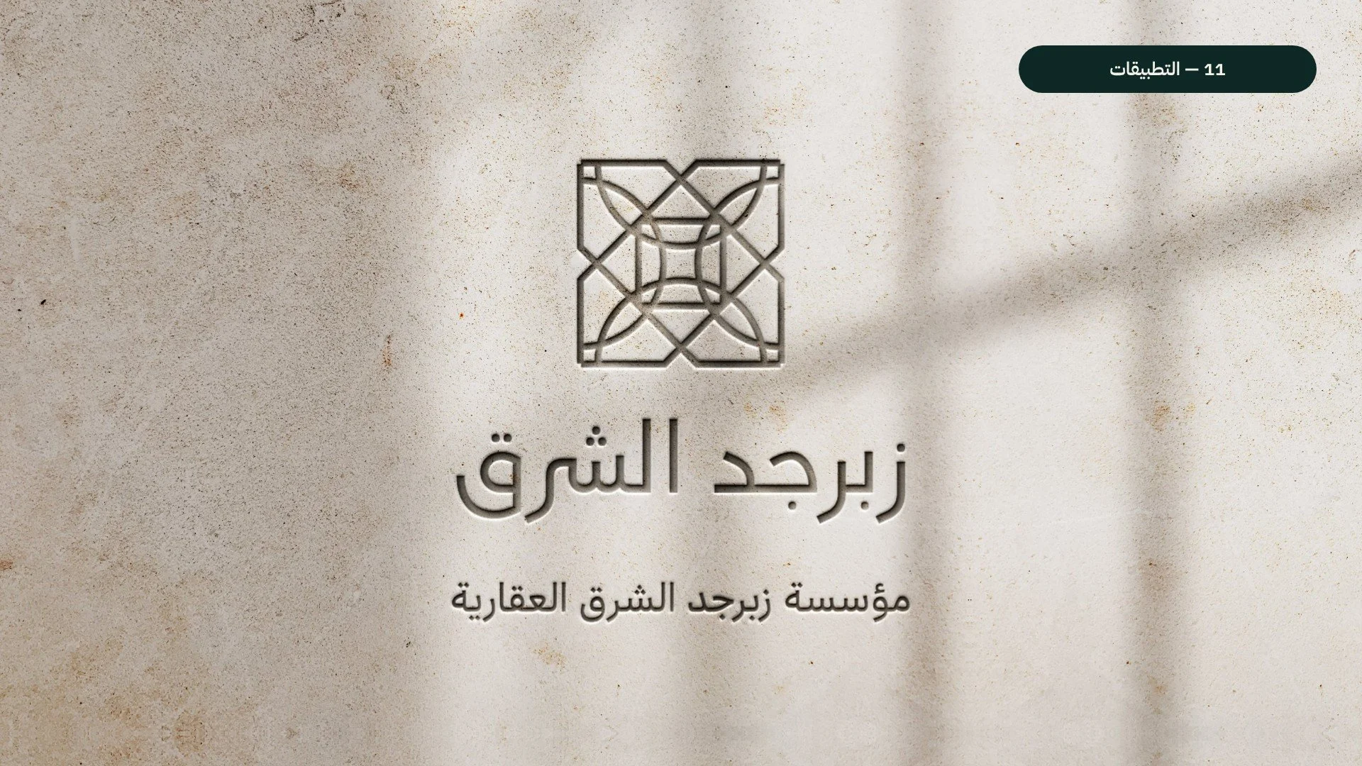
The identity truly comes alive when applied. Carved into a plaster wall with soft window shadows, the logo returns to the very craft that inspired it.
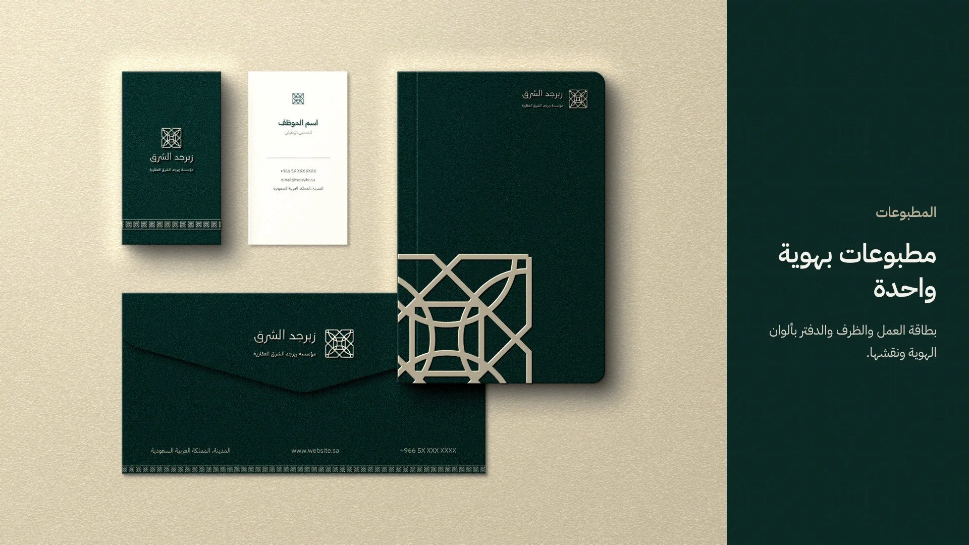
The stationery set brings sand-colored details onto deep green paper, creating a premium feel for business cards, envelopes, and notebooks.
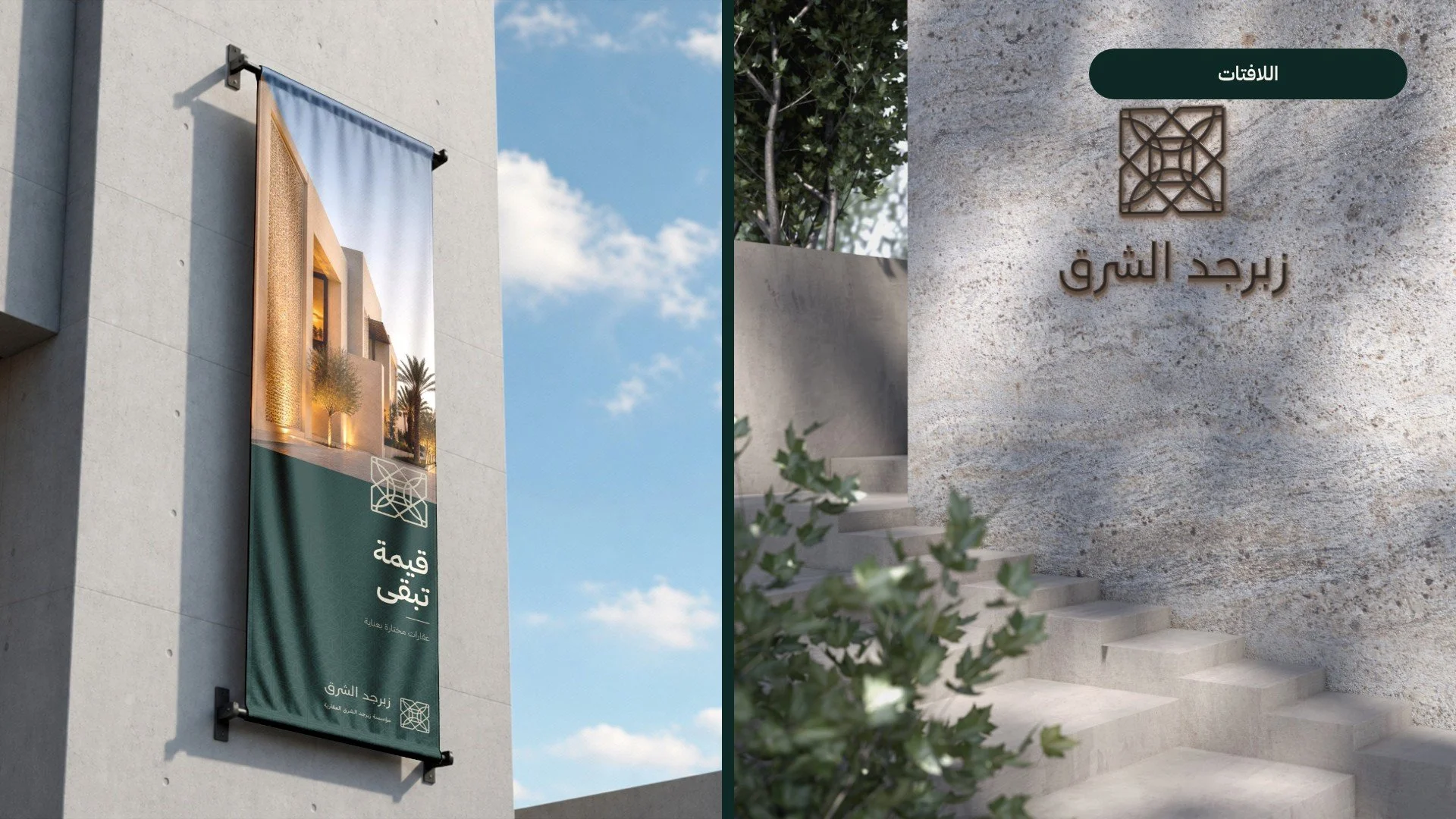
On building facades, the vertical banner and the entrance sign give the establishment a confident, recognizable presence.
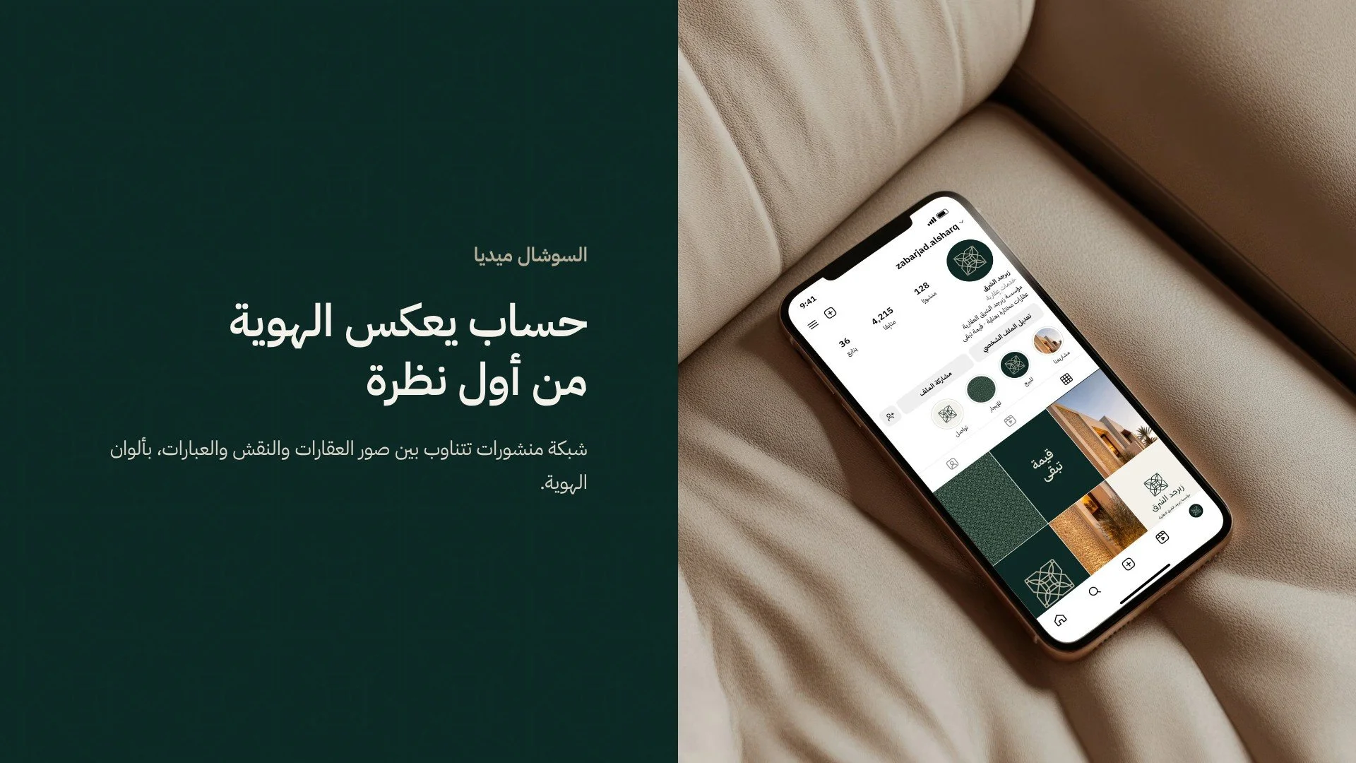
On Instagram, the feed alternates between property photography, patterns, and brand messages, creating a cohesive profile that reflects the identity from the very first glance.
The Result
Zabarjad Al Sharq now has a complete visual identity that sets it apart in a crowded market. It honors local heritage while feeling modern and premium, and it is built on a clear system that can grow with the business, from a single business card to a full building facade.
Have a project in mind?
At Aurisy Studio, we design identities that tell real stories. If you’re ready to build a brand that reflects your values and stands out in your market, we’d love to hear from you.
