
One Missing Letter Changed the Whole Story — Redesigning Gulnar Coffee's Brand Identity
Sometimes the biggest changes start with the smallest details.
We were using Gulnar Coffee's logo in a new design, and while working through the details, we noticed something that easily could have slipped past anyone: the English word "Coffee" in the logo was missing its final letter E — reading "Coffe" instead of "Coffee."
A small mistake, but it was enough to make us stop. A brand's visual identity isn't just a nice-looking mark — it's the first impression, the first layer of trust between a brand and its customers. So instead of patching the error, we decided to start from scratch.
From a Simple Fix... to a Full Rebrand
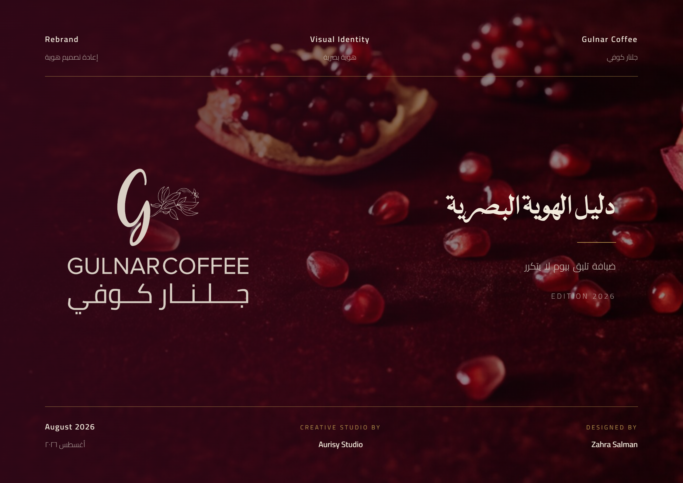
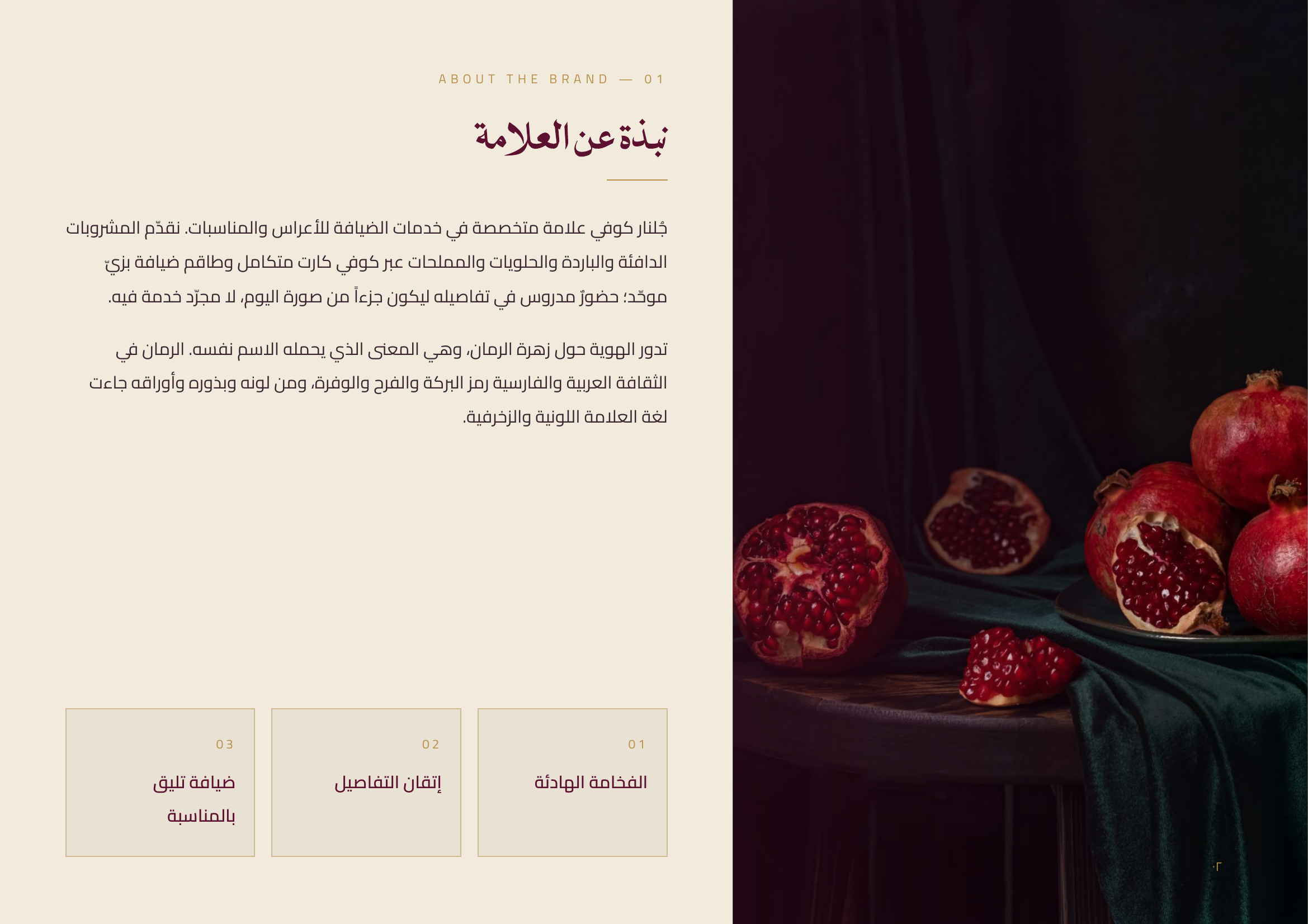
What began as a one-letter correction turned into a complete rebrand project. We went back to the meaning behind the name itself — "Gulnar," which literally translates to "pomegranate flower" — and built a visual identity that carries that meaning through everything, from the logo down to the smallest application detail.
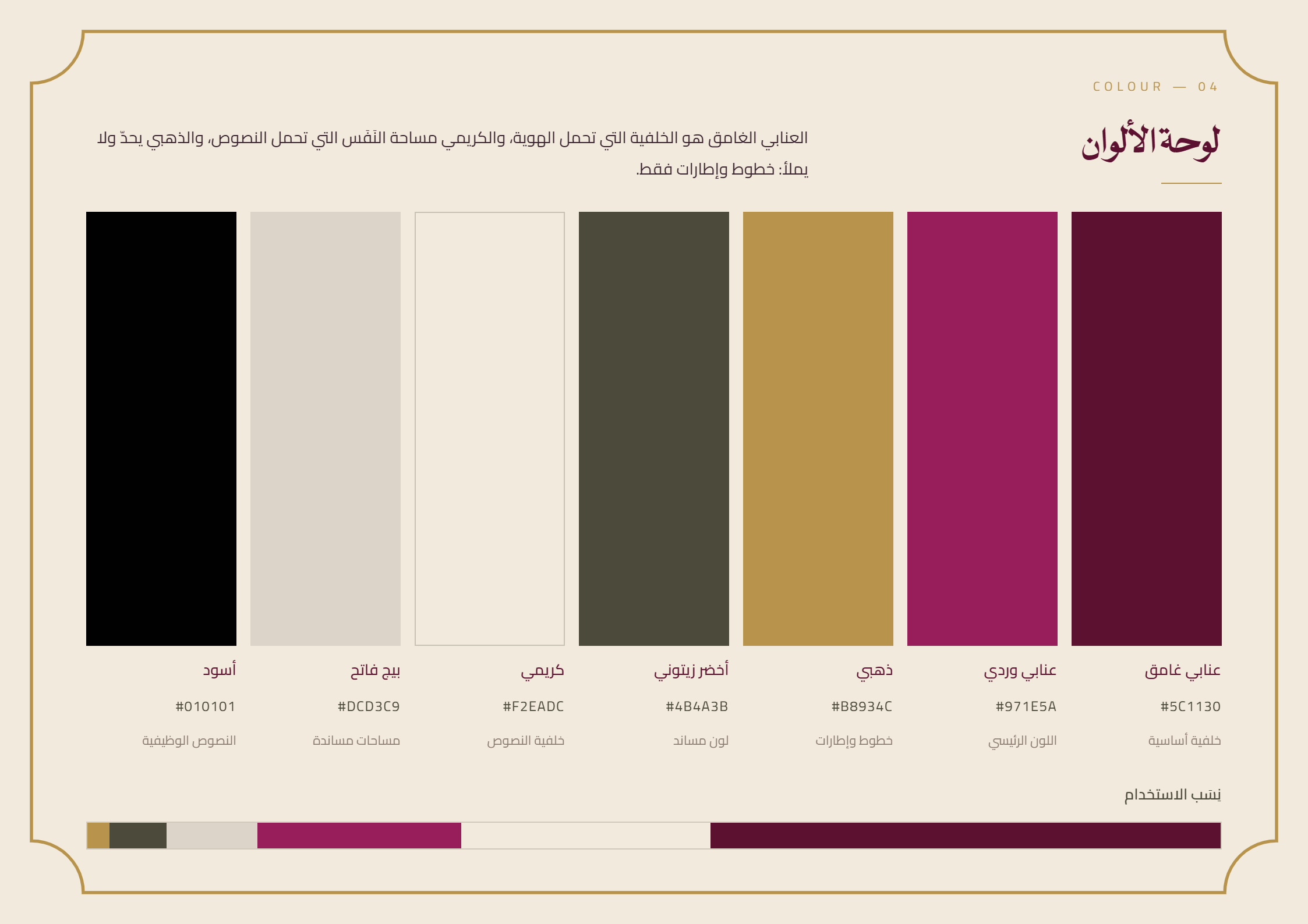
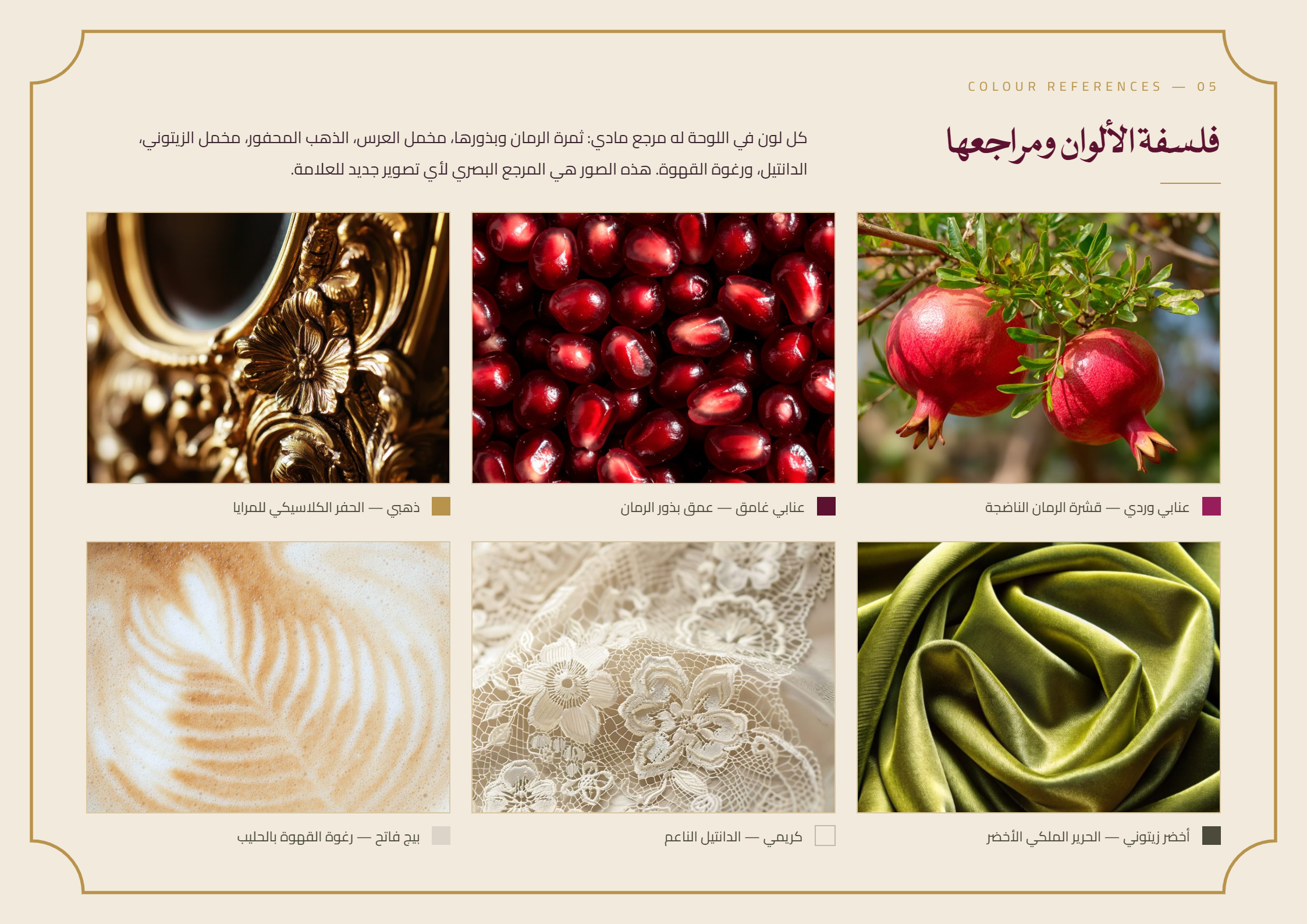
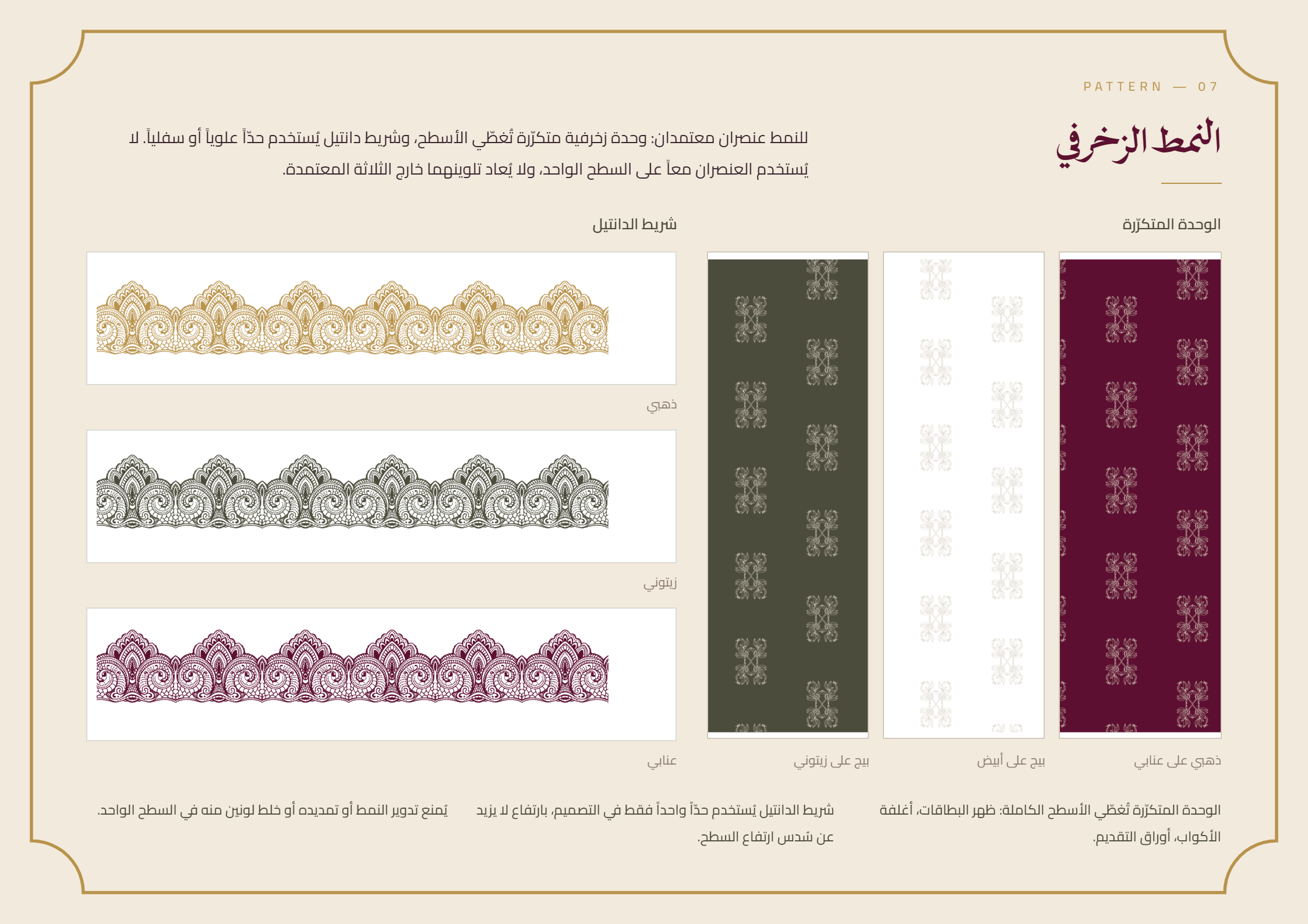
We chose a luxurious, classic tone that fits Gulnar's world of wedding and event hospitality: a color palette inspired by the pomegranate fruit and wedding velvet (deep burgundy, rosy burgundy, gold, and warm cream), with a recurring pomegranate-branch pattern appearing as a subtle motif across every application.
The Result
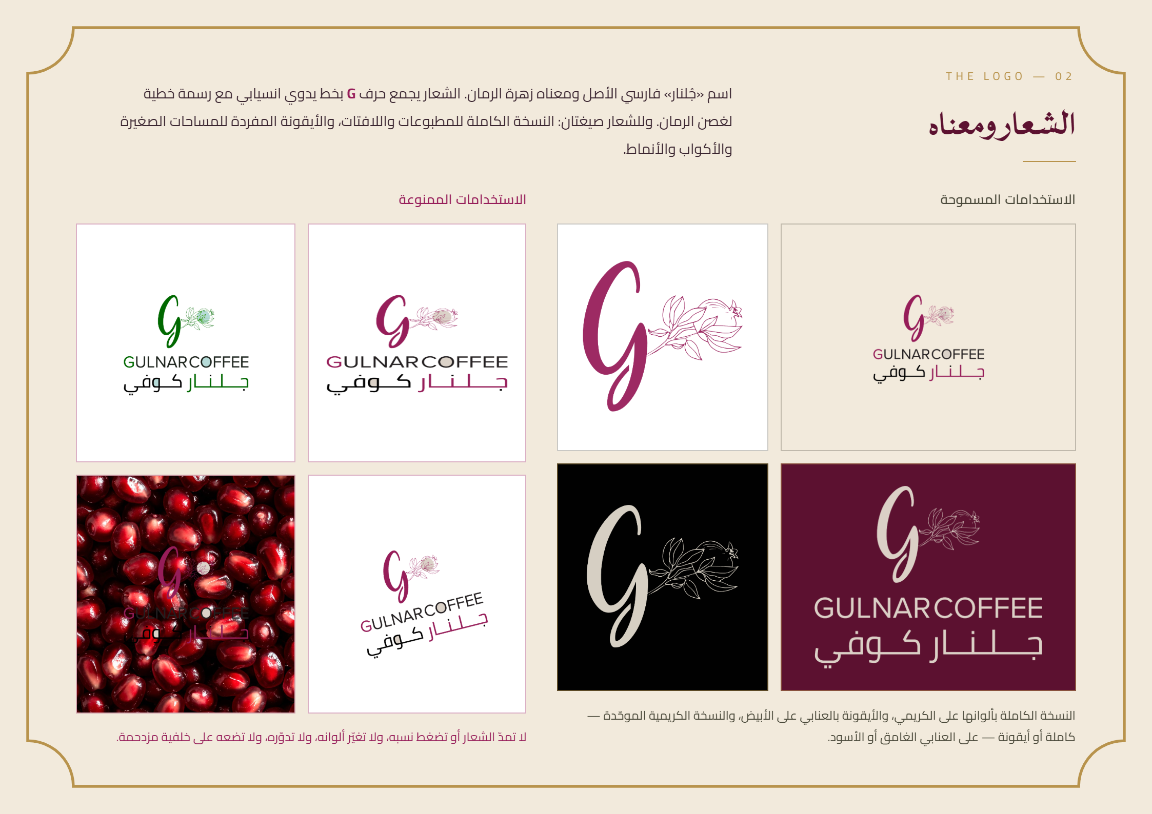
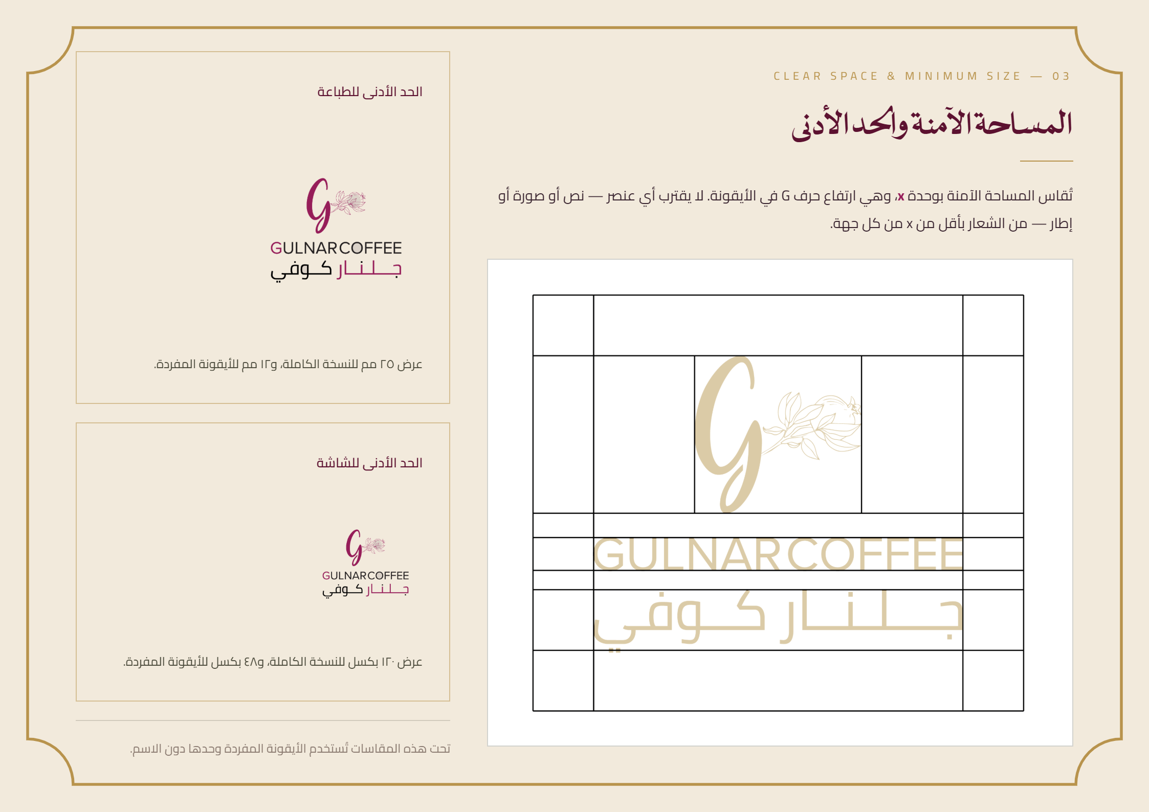
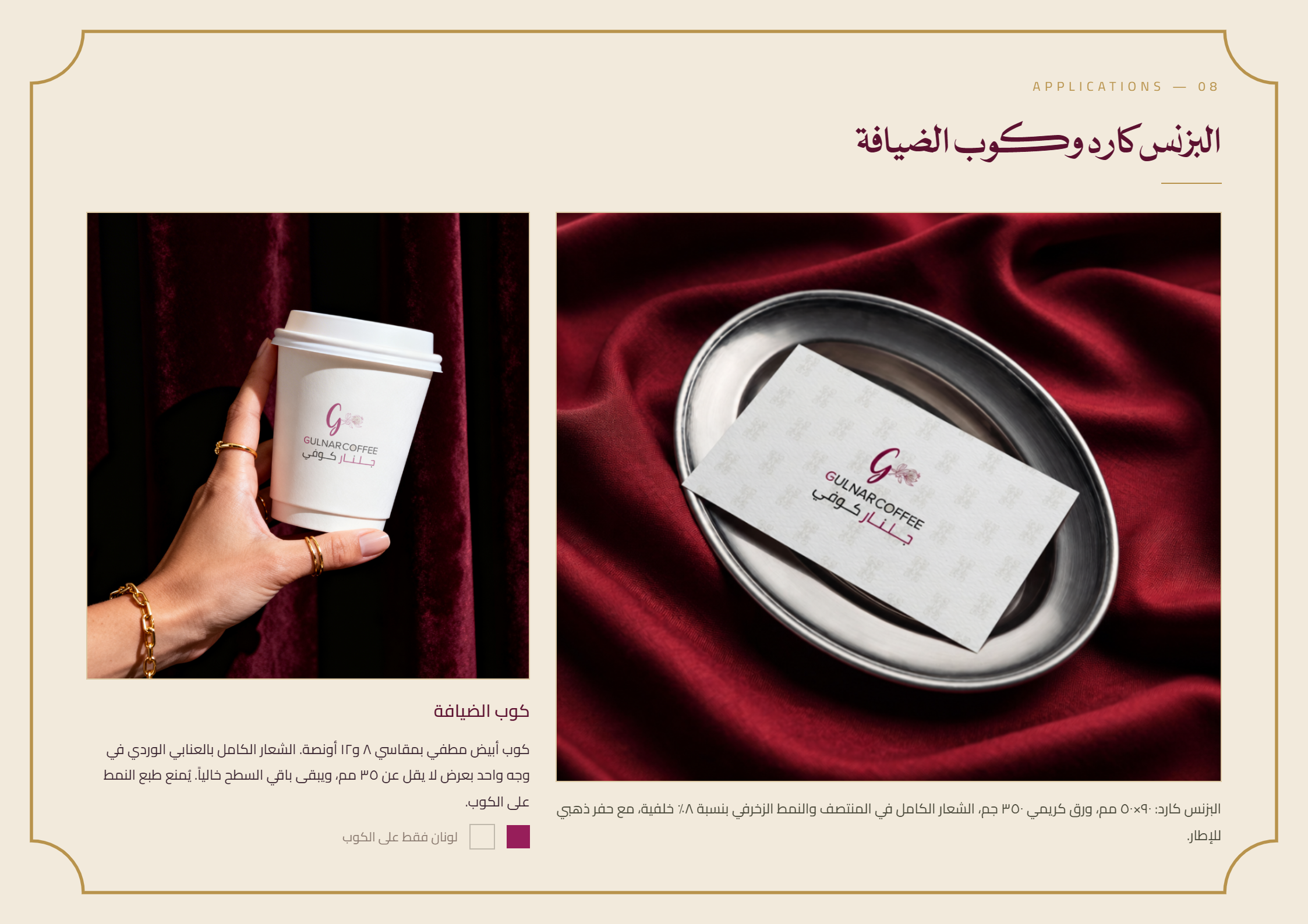
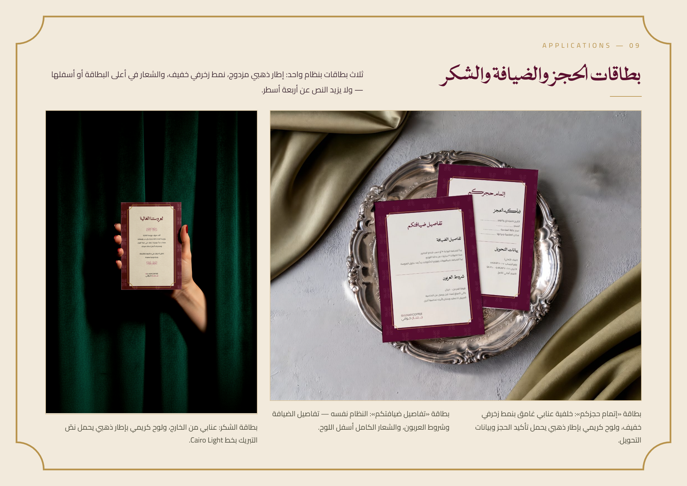
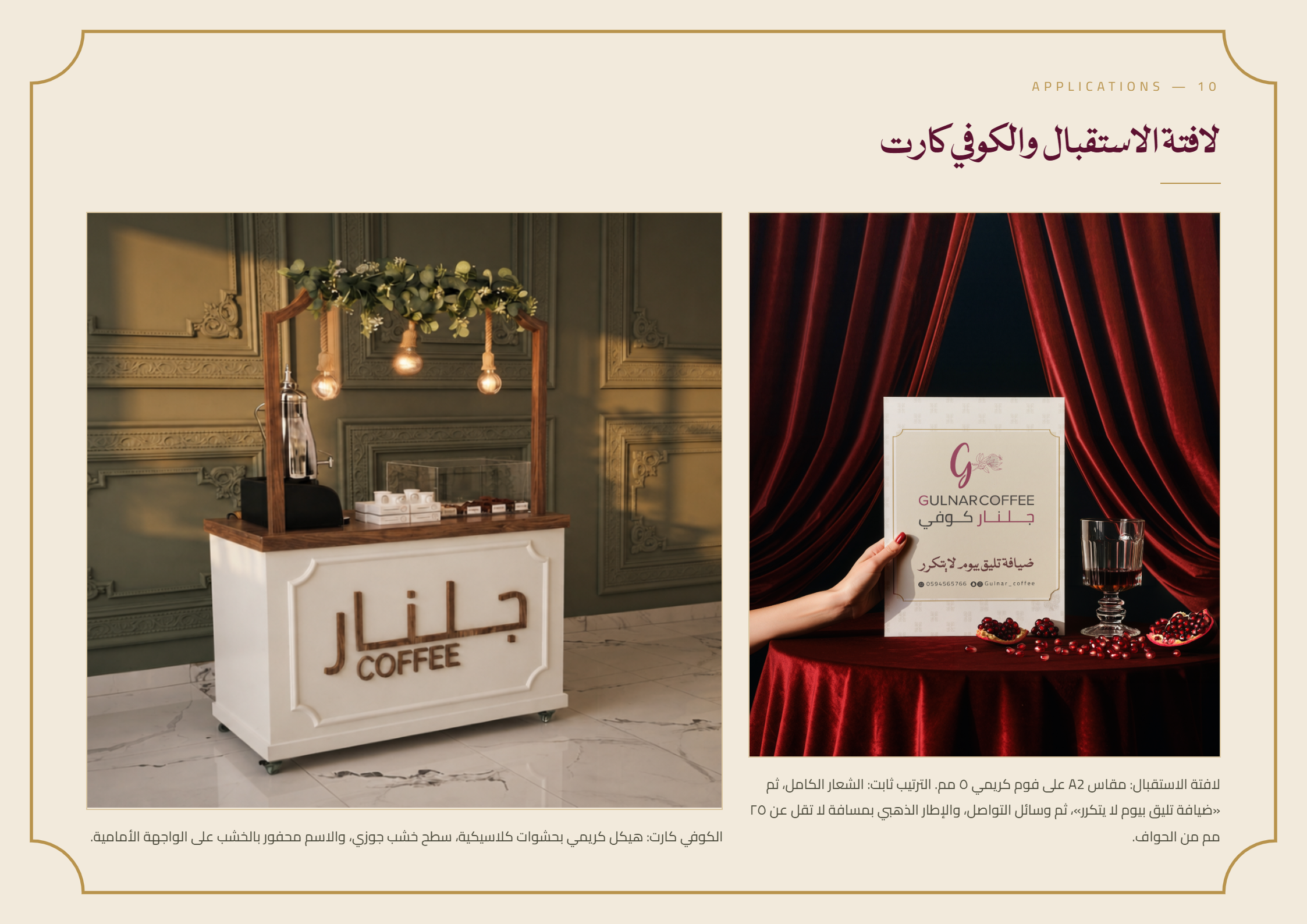
A complete brand guidelines book covering everything — the logo and its usage rules, colors and typography, all the way to real-world applications: business cards, hospitality cups, booking and thank-you cards, and even the welcome signage and coffee cart itself.
Gulnar Coffee's story is a good reminder: small details make all the difference — and revisiting your brand identity with a critical eye now and then isn't a luxury, it's essential to any brand's growth.
F A Q
What made you discover the error in the logo?
While using the logo in a new design for Gulnar Coffee, we noticed the English word "Coffee" was missing its final letter E. Careful attention to detail is a core part of any design process, and sometimes the smallest detail reveals the need for a bigger review.
Why didn't you just fix the letter?
Because any opportunity to revisit a brand identity is a chance to strengthen it entirely, not just patch a mistake. We used the moment to rebuild the identity from its roots — starting with the meaning of the name itself ("Gulnar" = pomegranate flower) — and delivered a complete system built to serve the brand long-term.
What does the new brand guide include?
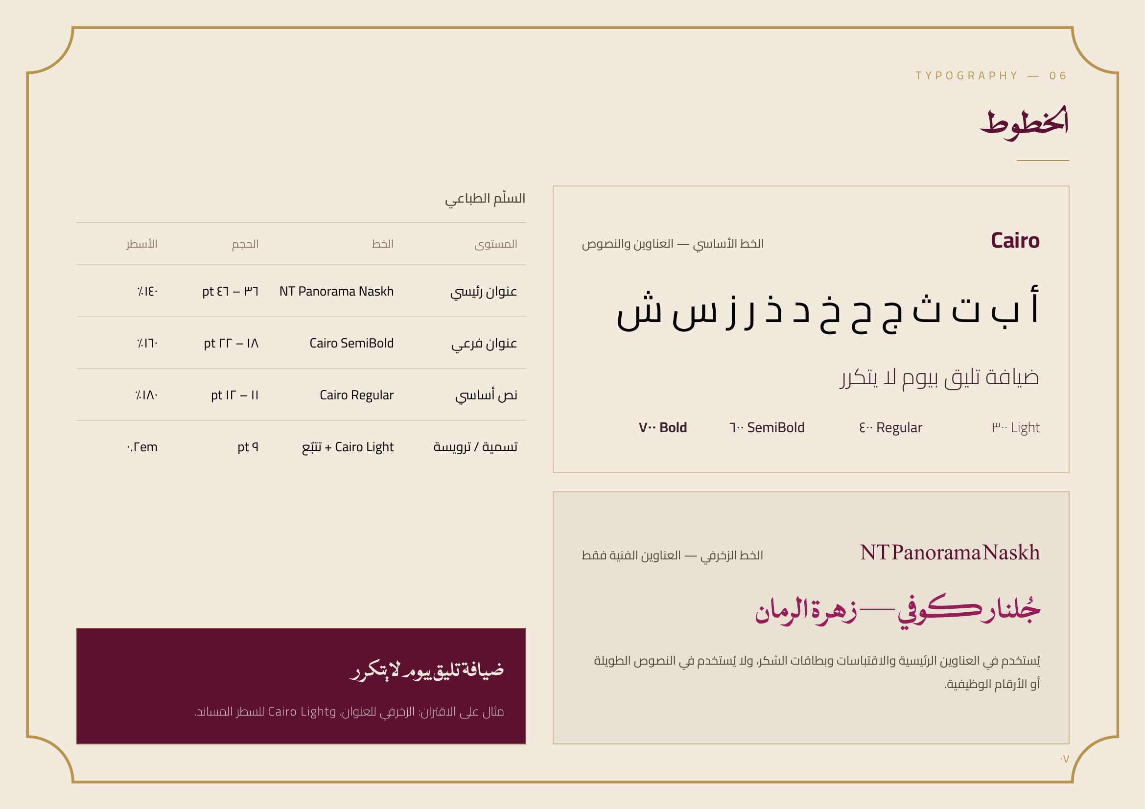
The logo and its usage rules, color palette and typography, the decorative pattern, and a full set of real applications: business cards, hospitality cups, booking and thank-you cards, welcome signage, and the coffee cart itself.
Is this service right for my brand?
If you've noticed inconsistencies in your visual identity, feel like you're missing a clear guide to unify your brand across applications, or simply want a second look to make sure everything's on point — we can help with the same level of care and attention to detail.
How long does a brand identity redesign take?
The Gulnar Coffee project took about two weeks from concept to final application — and that's roughly the minimum timeline for any complete brand identity project. It can take a bit longer depending on the scope of applications and the number of revision rounds.
How can I request the same service for my brand?
Click here to get in touch
